A childhood favorite, all grown up.
I reimagined the 90s classic Bug Juice as a nostalgic energy drink for Gen Z and Millennials who still remember the taste—and now need the boost.
Founded in 1990, Bug Juice was a sugary, fruity drink that defined recess for many kids in the 90s and early 2000s. Known for its bug-themed labels and neon colors, it became a vending machine staple, but like many nostalgic brands, it faded with time as health trends took over.
View Bug juice websiteWith so many Millennials and Gen Zers craving nostalgia, I saw an opportunity to revive Bug Juice—not as a kids' drink, but as an energy drink tailored to the generation that grew up on it. This version keeps the fun but adds caffeine, sugar-free options, and a more modern attitude.
Rebrand Bug Juice as a modern energy drink for young adults
Refresh the visual identity to blend nostalgia with a bold, edgy style
Position it as a lifestyle product—perfect for gaming, studying, and late nights


ARCHETYPE:
The Jester – playful, energetic, and joyfully chaotic
MISSION:
Delight. Energize. Entertain.
TONE:
Bold, nostalgic, irreverent
VISUAL STYLE:
Neon brights, playful bugs, glitch-inspired textures, and vibrant typography

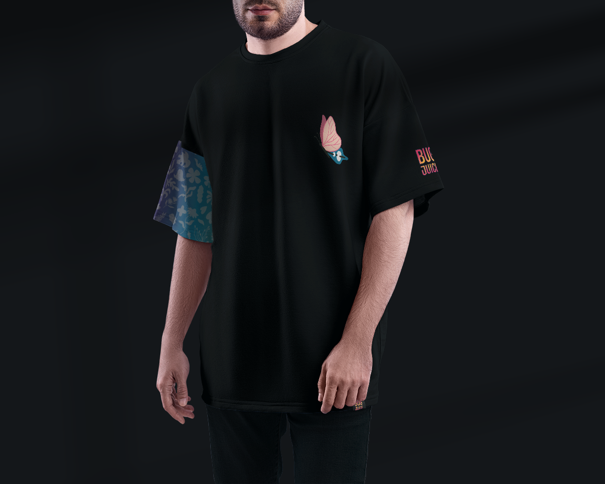
I started by playing with concepts that could retain the energy of the original while evolving the brand into something more rebellious for older audiences. The bug character evolved into something a little edgier and fun.

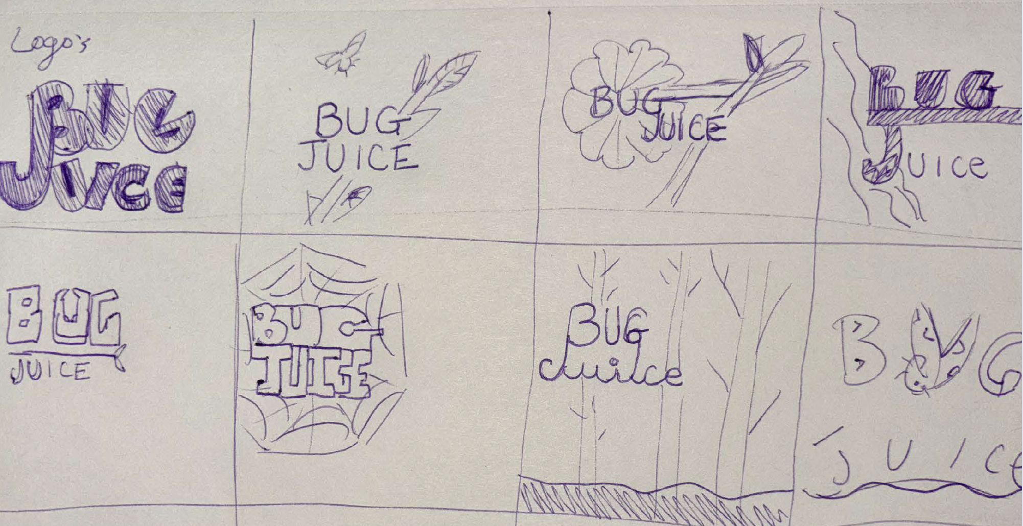
The final logo is a nod to the original, but sleeker and louder. The colors are high-energy and glitchy, inspired by arcade screens and neon packaging from the early 2000s.


To tie it all together, I created a sample landing page for Bug Juice’s new digital presence. It blends chaotic nostalgia with e-commerce functionality, letting users explore flavors, shop, and scroll through animations that bring the brand to life.
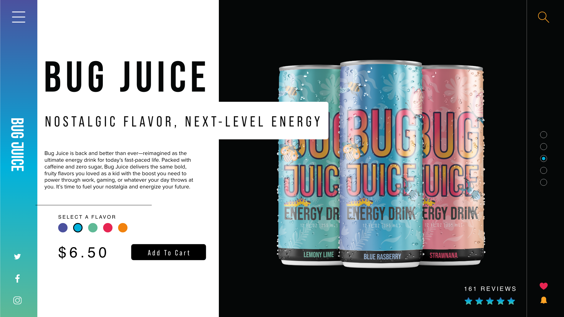
The new packaging is designed to pop off shelves—and screens. Bright colors, angular graphics, and a bold bug mascot all reinforce the rebrand's new identity. It’s something you’d spot in a fridge and instantly remember from your childhood—but cooler.